

(Translated from the original post on June 30, 2023)
Hello, this is Asakura.
It has been a very long time since I have written anything other than a report on GR meet 47. I hope you are well.
This time I would like to talk about the Image Control “Negative Film”, which is included in the GR III Diary Edition and is also compatible with the GR III/GR IIIx via a firmware update.
Okubo, our product planner, wrote about Negative Film in his Diary Edition article, and ARA wrote about the features of Negative Film and how to use it in his New Color article. This time I completely ignored the “negative film look” and tried to customize the preset the way I like, so this may not be helpful... but I ended up with colors I like very much, so let me write about them!
Let's start with the parameters of the “Asakura Custom” Negative Film.
Saturation: -2 (default: ±0)
Hue: ±0 (default: ±0)
High/Low Key: ±0 (default: +1)
Contrast: +3 (default: +1)
Contrast (Highlight): +4 (default: +0)
Contrast (Shadow): -4 (default: -1)
Sharpness and everything else stays at default
To match this customization, the white balance is also slightly tweaked.
White balance: Multi-Pattern Auto +B5 (+5 towards blue)
The basis for this is “Positive Film” that I have always loved, customized and used. For Negative Film, I set the parameters exactly the same - saturation low, contrast high, so that the bright areas stand out and the dark areas are subdued.
So what is the difference between Positive Film and Negative film?
It all comes down to how the red, blue, and green colors are rendered.
First of all, the red created with Positive Film is a solid "bright red" color, while the Negative Film has a slightly faded vermilion color.
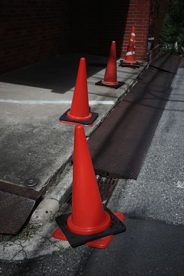
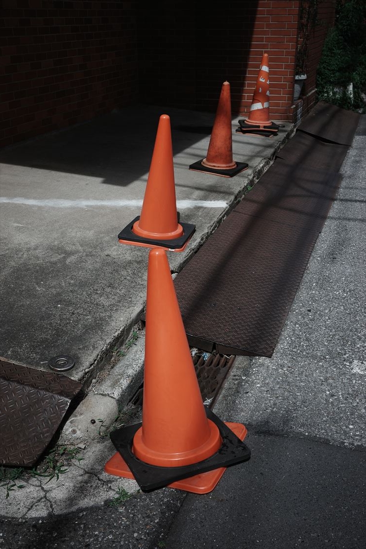
First image: Positive film, Second image: Negative Film (all parameters are set the same)
Next is blue, which, like red, has faded saturation and is a slightly muted blue.
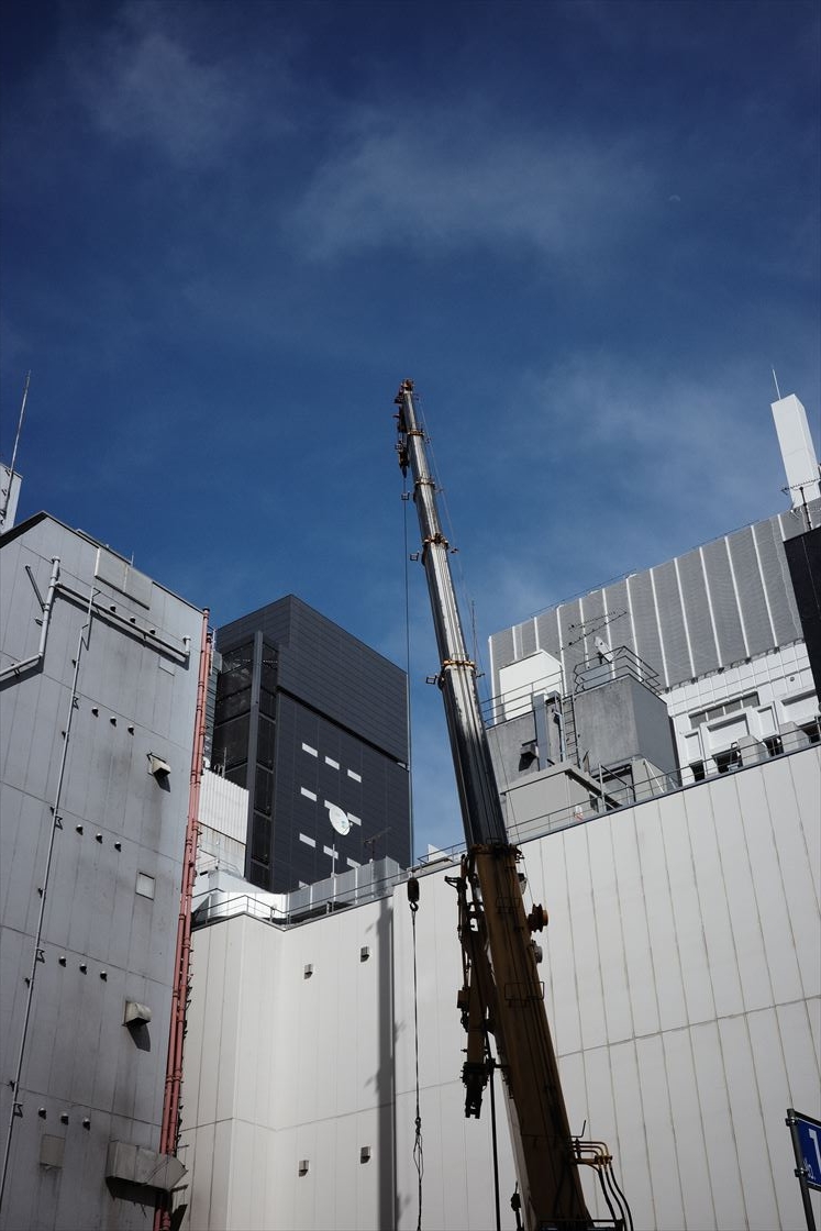
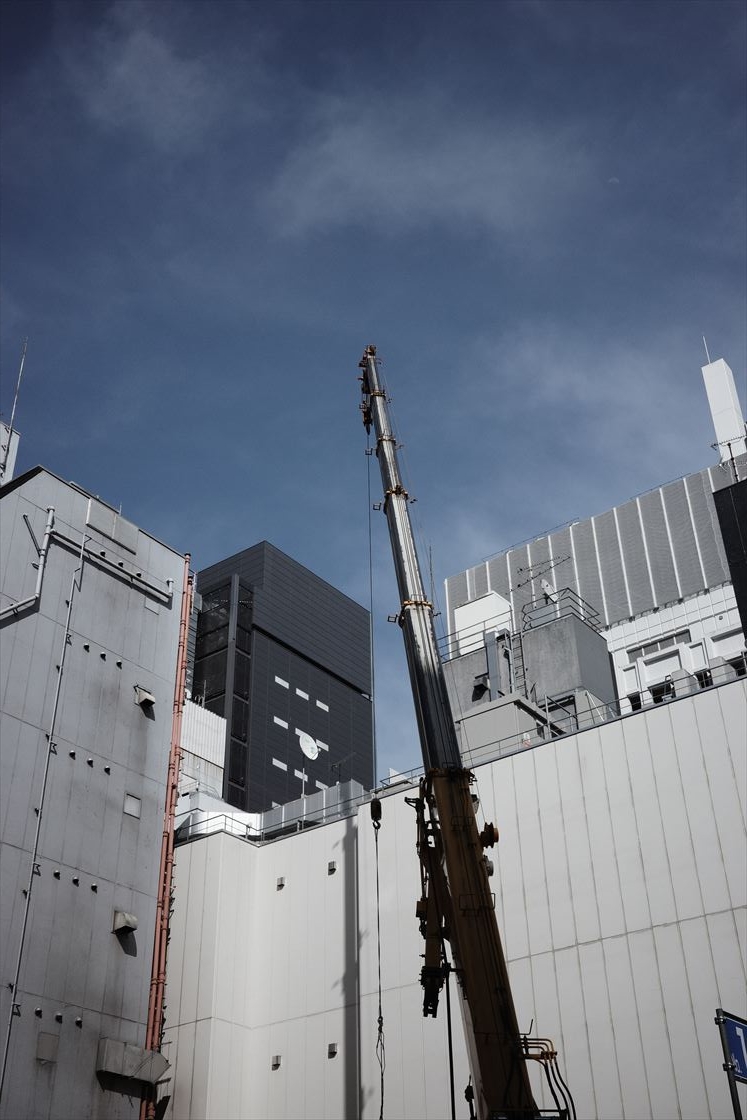
First image: Positive film, Second image: Negative Film (all parameters are set the same)
And finally, green. While Positive Film has a slightly yellowish green, Negative Film has a strong bluish tint, which gives it a much deeper impression.
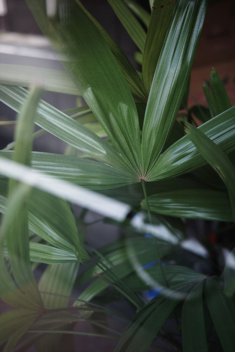
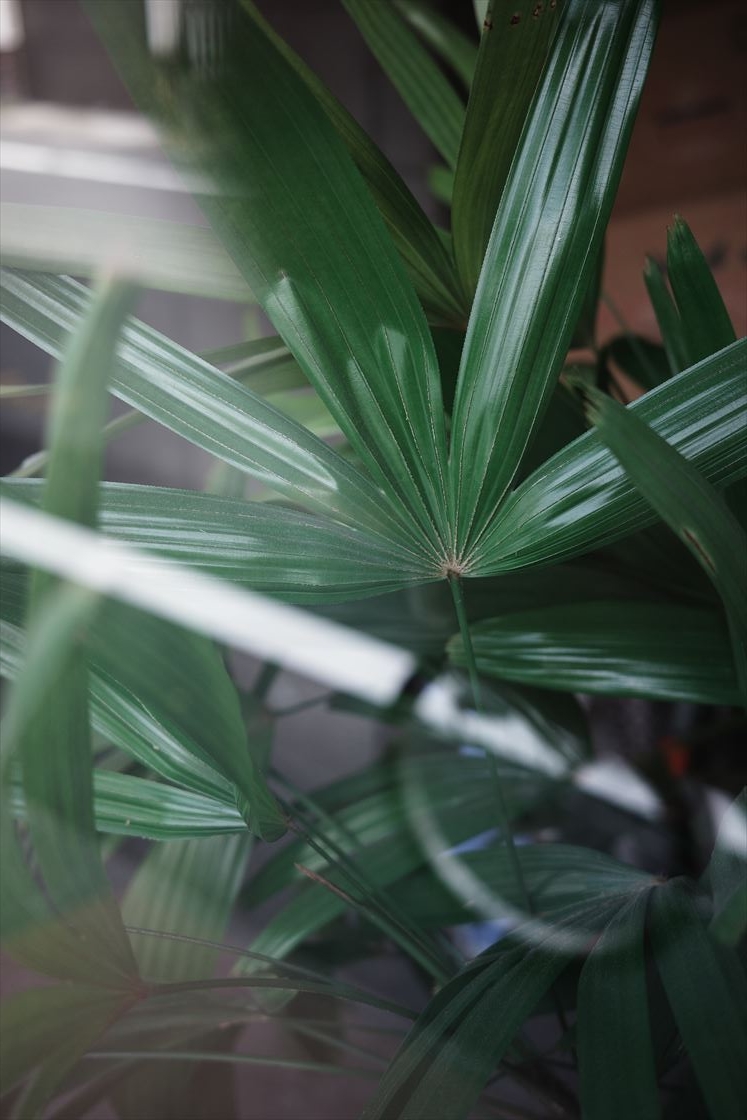
First image: Positive film, Second image: Negative Film (all parameters are set the same)
As you can see, even with exactly the same parameters, you can get a significant difference in certain colors.
I love the atmosphere Positive Film creates and have been using it exclusively for many years, but I have come to love the way the colors come out in Negative Film.
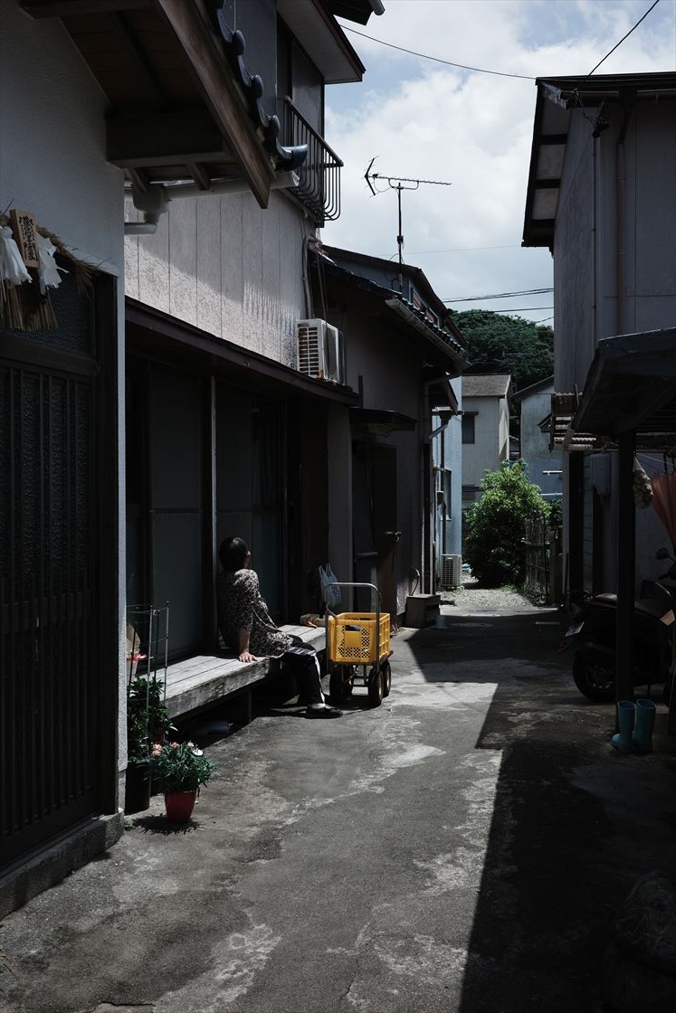
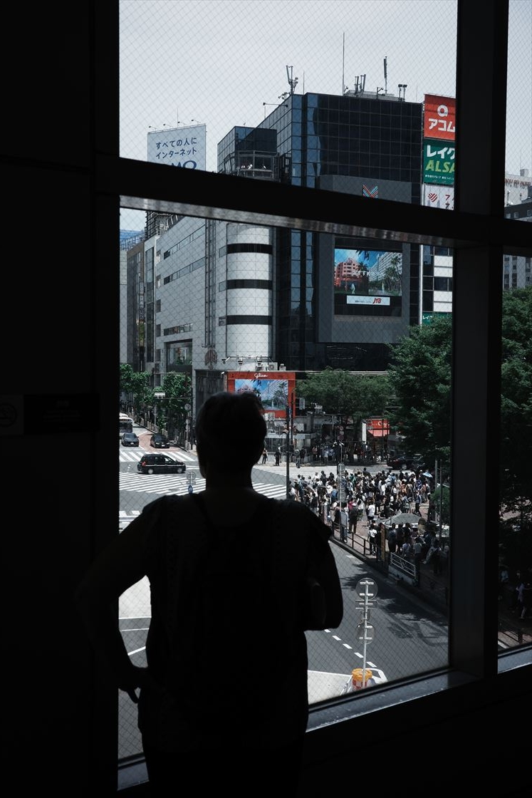
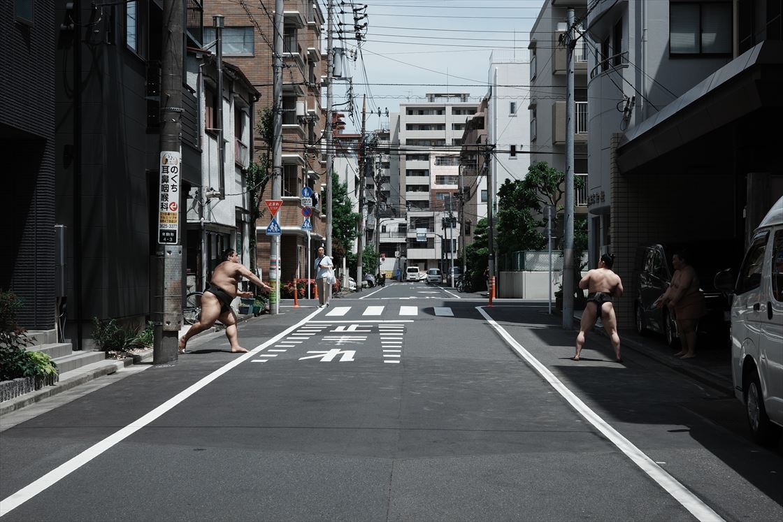
First image: GR IIIx, P mode, ISO200, 1/1250sec, F5.6, Negative Film (custom), multi-pattern auto (+B5)
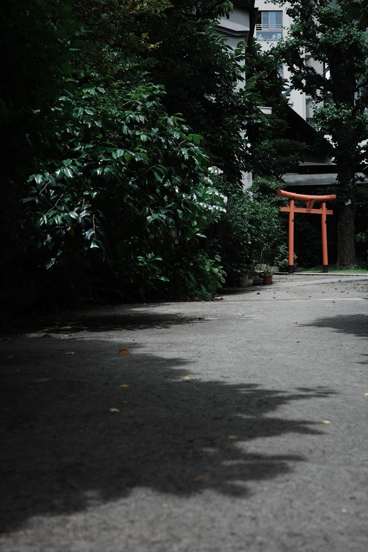
Second image: GR IIIx, P mode, ISO100, 1/500 sec, F5.6, Negative Film (custom), Multi-Pattern Auto (+B5)
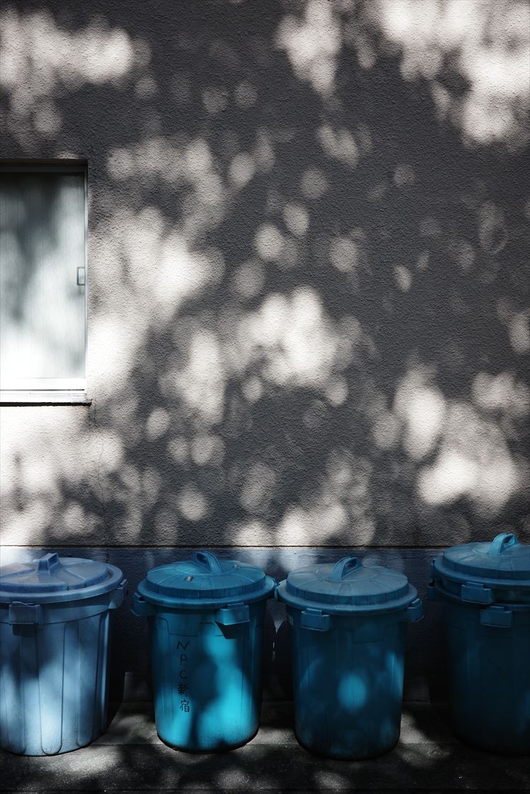
GR IIIx, P mode, ISO100, 1/800sec, F5.6, Negative Film (custom), Multi-Pattern Auto (+B5)
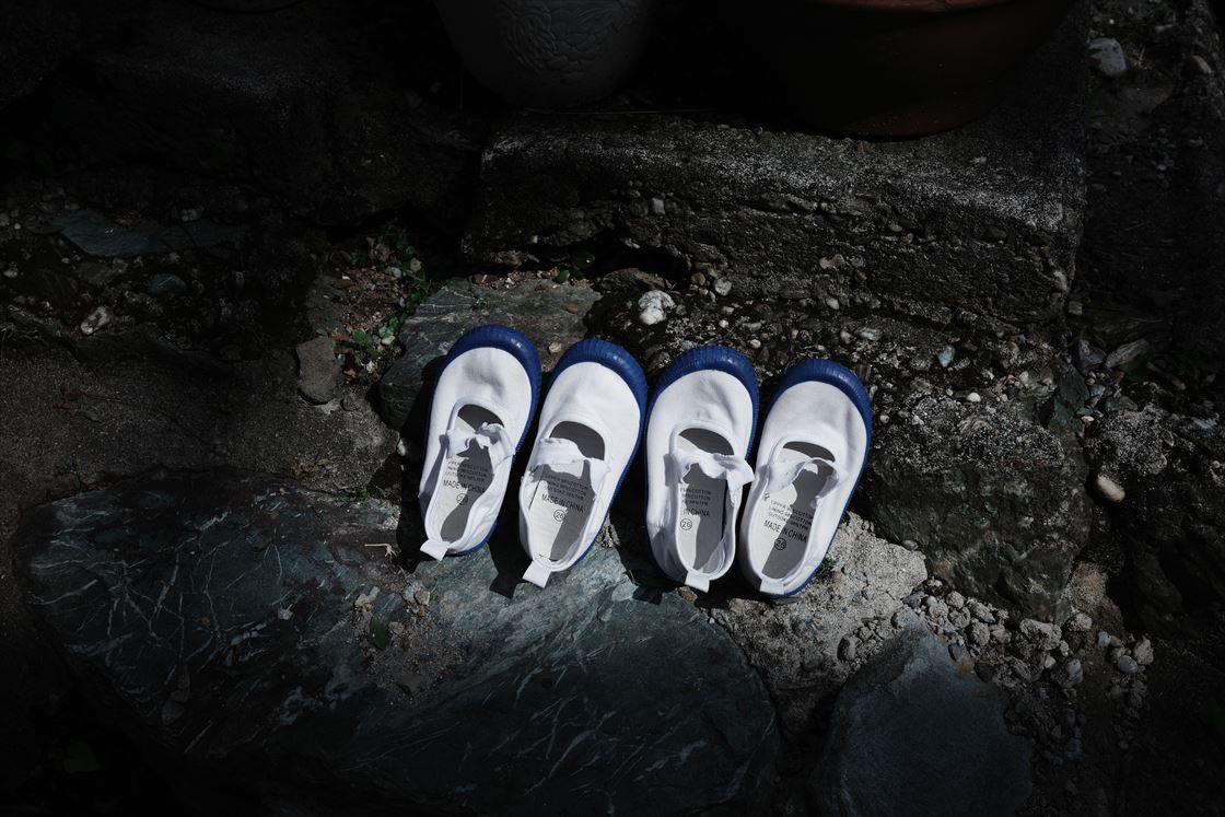
First image: GR IIIx,P mode,ISO100,1/400sec,F5.0, Negative Film (custom), Multi-Pattern Auto (+B5)
Second image: GR IIIx, P mode, ISO200, 1/400 sec, F5.0, Negative Film (custom), Multi-Pattern Auto (+B5)
The color is not vivid, but it has a strong “weight” and is elegant. I love this coloring so much now that I feel happy every time I release the shutter these days. I'd like to use both negative and positive film tones depending on the scene.
Have fun customizing your image control settings!
GR IIIx, P mode, ISO100, 1/1600sec, F5.6, Negative Film (custom), Multi-Pattern Auto (+B5)
(Asakura)


